Home Web Design SEO Our Work Pricing Contact 📞 727-637-9402 Get Started
⭐ 5.0 Rating · Trusted by 500+ Small Businesses

Responsive Web Design That Looks Perfect on Every Device

More than half your visitors are on a phone. If your site is hard to use on mobile, you're losing them. We build responsive, mobile-friendly websites that look sharp and work flawlessly on any screen.

No spam — we'll reach out within 24 hours.

Simple monthly pricing No long-term contract Cancel anytime
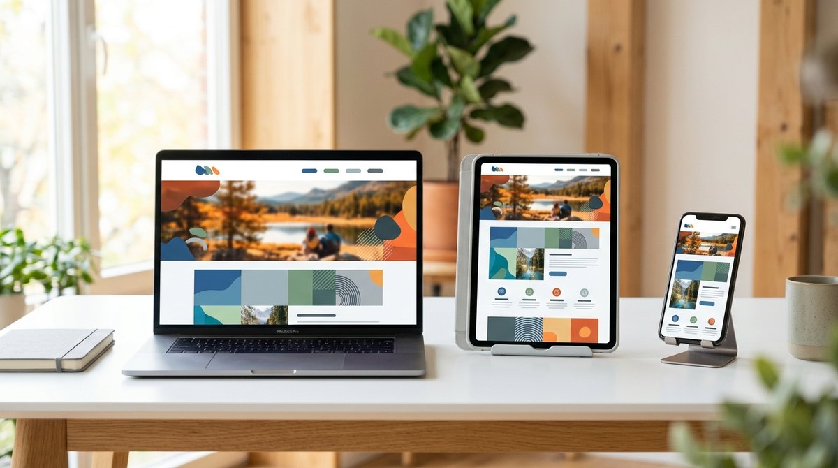
Desktop
Tablet
Phone

One Website That Works Everywhere

Responsive web design means your website automatically adapts to whatever device it's viewed on — a big desktop monitor, a tablet, or a phone in someone's hand. No pinching, no zooming, no broken layouts.

Google also ranks mobile-friendly sites higher, so a responsive build isn't just about looks — it directly affects how many customers can find you and actually use your site. Every website we build is responsive from the ground up.

Built Mobile-First, From the Ground Up

A responsive web design company that treats phones as the priority, not an afterthought.

📱

Mobile-First Build

We design for the phone first, then scale up — because that's where most of your visitors are.

🔄

Adapts to Any Screen

Your layout, images, and menus reflow smoothly on desktop, tablet, and phone.

Fast on Mobile Data

Optimized to load fast even on a phone with a weak signal, so visitors don't bounce.

👆

Touch-Friendly Design

Buttons, forms, and menus sized and spaced for thumbs — not tiny desktop clicks.

📈

Better Google Rankings

Google favors mobile-friendly sites, so responsive design helps you rank and get found.

Tested on Real Devices

We check your site across real phones and browsers before it ever goes live.

From Desktop to Pocket, Seamlessly

1

Plan

We map your content around how people actually use it on each device.

2

Design Mobile-First

We design the phone experience first, then expand to tablet and desktop.

3

Build & Test

We build it responsive and test it on real devices and screen sizes.

4

Launch

Your site goes live looking sharp everywhere — and we keep it that way.

Responsive Web Design Plans

No contracts. No setup fees. Cancel anytime. Every plan includes a fully responsive, mobile-friendly build.

Starter
Everything you need to look professional online.
$149/mo
  • Professional custom website design
  • Mobile-friendly, fast-loading design
  • Google Business Profile setup
  • Ongoing hosting & support
  • Month-to-month, cancel anytime
Premium
For businesses ready to dominate their market.
$497/mo
  • Everything in Growth, plus:
  • Advanced Google Ads optimization
  • Monthly reports & strategy call
  • Priority support
  • Multi-page / multi-location support

Already have a site that breaks on mobile? Our redesign service can fix it fast.

Responsive Web Design, Answered

Responsive web design is an approach where your website automatically adjusts its layout to fit whatever device someone is using — desktop, tablet, or phone. Instead of a separate mobile site, it's one site that reshapes itself for every screen.
Yes — every site we build is responsive and mobile-friendly from the ground up. It's not an add-on or an upgrade; it's standard on every plan.
Often the cleanest fix is a rebuild. Our website redesign service can turn a site that breaks on phones into a fast, fully responsive one without losing your Google rankings.
Yes. Google uses mobile-first indexing and favors mobile-friendly sites, so a responsive build directly supports your rankings. Pair it with our SEO services to go further.
It's included in every plan — starting at $149/month with no upfront bill. See our pricing breakdown.
Ready for a Site That Works Everywhere?

Let's Build You a Responsive Website

Tell us about your business and we'll build you a site that looks great on every device.